
Split Column
Split Column is a vertical display technique where the middle section of a columnar form is removed, resulting in a void contained within an implied column. more
Split Column | Retail
application
In retail interiors, Split Column is a custom volumetric display system that focuses attention on products displayed within the void of an implied columnar form. Split Column may appear individually, but is frequently repeated in multiples for an amplified effect.
research
Split Column can be analyzed on several levels. It is firstly important to understand the practice as a manipulation of form in space and the consequent effects resulting from this manipulation. The column's role in classical architecture will inform the parts of Split Column that are drawn from the classical column archetype. Visual merchandising deals specifically with the way that product is shown in a retail interior and how particular display practices in turn affect sales. Although the field of visual merchandising does not currently have terminology for Split Column as a formal display technique, it does deal with related display practices that are important to review. Finally, discussion of relevant retail history will deepen the understanding of how changes in the industry have influenced and shaped the evolution of Split Column throughout the 20th century.
At the most basic level, Split Column is a mass or volume that has undergone a subtractive transformation. Aside from basic geometric solids like spheres, cylinders, cones, pyramids and cubes, most other complex elements are the result of transformations of these solids, either through addition, subtraction or manipulation of form.1 The subtraction needed to create a Split Column is justified by several driving principles of design-unity, closure and emphasis-that are employed in order to achieve the desired visual effect. The two forms remaining once the middle section has been removed are still related as a single, complete entity due to unity. Their similarity in shape and placement one above the other relates them, still implying a columnar form despite being incomplete.2
Inference of related form known as unity is made possible by the concept of closure, which is derived from the psychological concept of gestalt: "We have an instinctive ability to fill in incomplete patterns and shapes. This principle, first put forward by German Gestalt psychologists in the early 20th century, suggests that our minds tend to ‘see' organized wholes, or forms, as a totality (Gestalt is the German word for ‘form') before perceiving the individual parts. Our minds also tend to find shapes in approximately related elements, such as the four dots perceived as a square."3
This visual relation of similar parts as a single whole is what makes the Split Column effect possible. Since the top and bottom portions of Split Column appear related in form and placement, they read as one object comprised of solid and void. Visual clues like the relative proximity and similar size and shape of the forms facilitate this completion, or closure, and help the brain to imagine the disconnected parts together as a whole.4
Once a Split Column is visually unified as a single spatial element, the principle of emphasis dictates its relationship to the rest of the retail interior. Various factors can determine how an element is emphasized, however the size and shape of Split Column are usually what gives it prominence in the spatial composition of a store. They are oftentimes larger in relative scale, and their unique form often contrasts with an interior's other design elements. Placement and orientation in space can also emphasize a form.5 The standalone nature of Split Column, allowing customers to walk fully around and experience it from all sides, often sets it apart as an autonomous element in a space. Emphasis appears on two distinct levels in the Split Column display technique. The form initially draws attention to itself because it is differentiated within the context of the store. On a micro-scale, the product contained within is highlighted and emphasized as important because of its placement within the void. This means that Split Column first emphasizes its own form and then redirects viewers' attention to emphasize product contained within.
With an understanding of the way that Split Column is generated and how it effectively supports display, it is possible to proceed to the resultant visual effects. Architectural theorist Thomas Thiis-Evensen's discussion of height motifs in relation to walls is relevant to Split Column since columns are similarly vertical in nature. Thiis-Evensen considered both walls and columns in three parts, or "fields of energy:" upper, middle, and lower fields, or capital, shaft, and base in the column's case. The upper section is most closely related to the ceiling plane and the lower section to the floor, while the middle mediates the relationship and determines the height motif of the entire composition.6 This tripartite approach to dissecting a vertical element is appropriate, given the important role that the void plays in Split Column. Thiis-Evensen's split and opening motifs speak to Split Column because the size variation in the middle section has alternative implications in each scenario. Although he does specifically mention the broken column, a column stump used in Roman Antiquity as a grave stone, the concept (and name) behind Split Column is more accurately derived from Thiis-Evensen's height motifs since a broken column does not have a top.
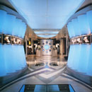
Thiis-Evensen's height motifs inform the visual effects of the center void relative to its top and bottom forms. When the height of the void in a Split Column is less than the combined height of the top and bottom forms, it is considered a split motif. "The result is a middle section which seems to be pressed from both above and below in that the lower field seems to rise, while the upper field seems to sink."7 For retail display purposes, this establishes a highly concentrated focal point. The downward movement of the top and the upward movement of the base converge in the central void where the product is displayed, as seen in this example from Norwegian clothing and accessories store, Stash.8 The extreme proximity of the two nearly identical rectangular forms made for a strong visual connection between the forms and a compelling void in which bags were displayed.
In contrast, when the void is larger than the combined height of the top and bottom forms, the effect is instead akin to Evensen's opening motif. "The result is a wall that seems to expand at the middle by pressing the upper field further upward, while at the same time it pushes the lower field further downward."9 In retail applications, the opening motif is employed when spatial definition is desired but with less imposition on the openness of a space. An Isaac Mizrahi for Target pop-up store used this tactic to create informal fitting rooms.10 The mirrored Target logo on the floor and ceiling implied a cylindrical form that feels as if it were expanding and opening, rather than encroaching on one another in the way that a split motif does. Overall, the split motif has been more common in retail display practice, likely due to its more dramatic visual impact and greater visual connection between the forms than the opening motif.
It is interesting to test the Target pop-up shop's fitting room against the definition of Split Column, since the expression was undeniably related but decidedly different. As an extreme case of an opening motif, it effectively served the purpose of demonstrating the visual effect of a center void that is larger than the forms. The question lies in whether a column implied entirely by a pair of two-dimensional shapes is still a Split Column. When the curtain to the fitting room was open, all that remained were the two-dimensional circular rug on the floor and the light on the ceiling. When the fitting room was occupied and the curtain was drawn closed, however, a columnar form resulted. The cylinder of fabric was visually related to the circular light of the same diameter on the ceiling, allowing it to read as a single, unified element. Perhaps then the fitting room was conditionally a Split Column; it was not a Split Column when open and unoccupied but became one when the curtain was in place. The deciding factor lies in the underlying strategy behind the fitting room compared with that behind the Split Colum intype. With the Target fitting room, two-dimensional forms imply the column, rather than implying one with the aid of similar, three-dimensional top and bottom forms simply missing their middle. Split Column is also ultimately defined as a display solution, and the void above this fitting room's curtain when pulled closed did not accommodate display. This type of mimicking of two-dimensional form on floor and ceiling commonly appears in contemporary retail design practice but are not considered expressions of Split Column.
It is advantageous to consider the Split Column intype within the context of retail display practice. Visual merchandising refers to the approach in which product is attractively shown in a retail setting in relation to sales and encompasses many of the relevant principles and effects associated with Split Column. Merchandisers have not previously identified Split Column as an archetype, likely due to the custom and often architectural nature of the display technique. Since visual merchandising usually falls within the realm of shop owners', managers and in-house designers rather than an architect or interior designer, displays are created by a vast assortment of movable display fixtures to flatter and feature specific products. Despite the distinction between these movable fixtures and more permanent built-in store furnishings, the guidelines that visual merchandisers use when arranging product displays are relevant to the consideration of Split Column as a display practice.11
Visual merchandisers use the various properties of line-horizontal, vertical, diagonal, or curvilinear-as an organization tool. Split Column especially draws upon the vertical line's inherent ability to attract attention, since vertical elements are naturally more readily apparent in the visual field than their horizontal counterparts. It is usually preferable to emphasize or give dominance to specific elements in a display composition. As discussed, Split Column emphasizes both its own form as well as the product displayed within it. The form then becomes a key focal point in a retail space.12 Visual merchandisers also often use the principle of repetition, since "by repeating or reiterating an idea or motif, that concept becomes more emphatic, more important, and thus, more dominant."13 Split Column can appear as a singular element, or it can be repeated and featured in multiples for a greater visual impact. Finally, it is important to be cognizant of the heights at which products are displayed for viewing versus interacting. Split Column becomes a useful tool for placing product either at a comfortable eye level or at table-height for easy interaction, depending on the intended level of engagement with product.14
Over the course of the 20th century, several key changes in the retail industry have shaped the evolution of Split Column within the context of the retail interior. An overall shift in focus from traditional, individualized customer service to quantity of mass-produced, self-selling product, to the contemporary, all-important brand image, was reflected in the way that Split Column manifested itself over the years. Although shopkeepers consciously made use of "design and display...to entice customers and enhance the attractiveness of goods" in the eighteenth and nineteenth centuries, architects and designers did not become heavily involved in retail design until more recently.15 Prior to the 1930s, architects in the United States were designing large-scale department stores but had not yet become widely involved in the design of smaller specialty shops.16 Prior to the Great Depression, trained architects in the U.S. "had not been greatly interested in store design, nor had it come to the attention of the average merchant that architectural skill would justify the cost of the architect's services."17 Difficult economic times conveniently brought architects and merchants together. Architects had less work since negligible building occurred, while merchants began to notice the way that attractively designed stores and product displays helped mass-produced products still feel unique and special.18 By the 1930s, architects involvement in shop design increased and stores recognized that their store interiors could differentiate them from competition in the marketplace.19
Whether coincidental or related, Split Column appeared in the United States around the time that architects and designers began designing for retail. As a custom, architectural display system, its early appearances coincided with the increased involvement of the architectural profession in designing retail interiors. Although there were some early examples of Split Column in the 1940s, it was by no means as popular as it is in contemporary design practice. In the first half of the 20th century, retail interiors were designed to support a high level of customer service, with specific architectural details prescribing roles and mediating the customer/sales associate interaction: "The arrangement of furnishings...does more than dictate modes of perception and access by the customer; it also turns the seller into an indispensable intermediary in the transaction...Customers are required to rely upon the salesperson in order to select a suitable product."20
An example of the way that the interior guided the interaction was in the traditional set-up of the glass display counter over which customer and salesperson would meet. The salesperson would show the products to customers, offering knowledge and advice. Drawers for product storage were often located behind the counter that only the sales associates had access. In this way, there would not have been a need for a display technique like Split Column at this time because the sales person mediated most of the interaction customers had with products. Evidence in the historical examples of Split Column demonstrates that its early applications were often associated with the design of this sales counter rather than individual product displays.
In its contemporary form, Split Column has been used to feature products in such a manner that the customer is invited to interact with the merchandise. This attitude towards retailing would explain why the modern form of Split Column developed concurrently with the rise of self-service shopping models. Post-WWII, price tags, informative labels and more accessible product displays armed shoppers with the tools they needed for a more independent shopping experience that was less reliant on personalized attention from a salesperson.21 Professionally-designed retail interiors intended to facilitate self-service would have turned to design strategies, like Split Column, that were more sophisticated display solutions, in order to provide stores with distinctive interiors that enabled customers to help themselves.
While the shift in emphasis from facilitating service to displaying product marked the likely origins of Split Column as an archetypical practice, the more recent emphasis on brand has influenced the way that Split Column has appeared in its contemporary applications. "Since the nineties in particular, attention has been focused more and more on exposition of the brand identity rather than representation of the product. Many different strategies are applied in the quest for consistency between the image of fashion and the image of the brand, but they all have one objective: creating an immediate impression that positions the name and the brand at the top of the mind. Physical space is increasingly one of the preferred means of communication."22
This heightened focus on overall brand identity has led to increased recognition for the ways in which a store's interior design contributes to its brand's image, given that the spatial experience within the store is one of the most tangible and accessible aspects of the brand. In this context of highly branded retail interiors, Split Column has flourished as a means for integrating custom display elements that are consistent with the desired look of the brand into a space. In recent years, this shift in perspective has certainly diversified the geometry and form of Split Column, since the focus is less on highlighting the product and more on crafting the store's overall image and experience. The applications in the 1990s were fairly conservative, representing the minimalist aesthetic that was popular in retail design and spatial branding at the time. The reactions to and movements away from minimalism in retail interiors in the late 1990s and into the 2000s brought about exaggerated extremes.23 This exaggeration was apparent in the way that Split Column has most recently become exceptionally sculptural and playful, rather than adhering to a stricter interpretation of the column.
Chronological Sequence
Split Column's early manifestations coincided with the design profession's relatively newfound interest in retail design. Several inklings towards contemporary versions of Split Column can be found in the 1940s, as seen here in the Parcel Post (1946) store designed by famous retail-turned-hotel architect, Morris Lapidus.24 A semi-circular form containing recessed lights was included above a semi-circular display counter for accessories or other small product below. The manipulation of scale in the top form still allowed this Split Column to obey the design principle of unity despite being larger because the two parts still related in shape and orientation.25 The strategic placement of the round counter against a mirrored wall strikingly completed the form; the appearance of a full circular form accentuated the Split Column effect, since it implied a whole rather than half cylinder as it would have without the mirror. Early examples such as this one were more similar to Bottoms Up relative to contemporary instances of Split Column in the way that the strategy was used to define a zone of service and activity as opposed to a strategy for straightforward display. Historical examples such as this one, however, were a necessary step for movement towards Split Column's contemporary expression as an archetypical retail display technique.
The application of the Split Column strategy for service counters continued into the 1950s. Simco Shoes (1950) featured a suspended rectangular form that referenced the row of vitrines below.26 The singular top form united the grouping of multiple table-height showcases below that functioned both as display and service counter. Lighting was incorporated into the top forms even in early interpretations of the archetype, setting precedent for Split Column as a strategy both from drawing attention to product displays as well as lighting them.
Although previous examples of Split Column for sales counters incorporated product, thereby maintaining their function as display and adherence to the archetype's definition despite being service-oriented, the Carol Antell shop's (1952) wrapping station did not display product aside from two small vitrines recessed in the wall.27 In that regard, this counter violated Split Column since the definition specifically differentiates between static display and areas of activity as with Bottoms Up.28 Given that retail was shifting towards its contemporary self-service model in the 1940s and 1950s, interpretations of Split Column during this transitional period were still applied to service counters as the traditional focus of the retail exchange. The use of vertical forms to highlight elements in plan represented the development of the archetype to its present form, evolving from articulating an area of service to encapsulating product. The strong solid-void relationship utilized related geometric forms to frame a service within a void much as it would in the product displays in decades to come.
Architects and designers continued to use ceiling forms to reinforce important areas in retail floor plans in the 1960s and the expressions began to appear more like their contemporary form, now highlighting static display rather the service counters as in previous decades. The applications were still abstract in form and suggested vertical relationships without truly visually implying vertical form. In the salon of a suburban branch of department store Carson, Pirie, Scott & Co. (1964), an eye-catching chandelier was hung over a mannequin elevated on a plinth, in order to draw attention to the featured display in an otherwise open floor plan.29 Despite being an admittedly weaker example than more current forms of the archetype, the strategy was aligned with Split Column. Two related forms were used to encapsulate a void within which to feature product. This use of the solid/void relationship as a display strategy was pivotal and provided solid evidence for the movement towards more resolved interpretations of Split Column.
Split Column achieved iconic status in the 1970s, the decade boasting numerous examples of columns that quite literally appeared to have been "split." High-fashion menswear shop Lehman-Saunders (1971) used the Split Column motif as a technique for both unification and differentiation in the store's open floor plan.30 The cylindrical ceiling forms were versatile, some suspended over displays or seating while others contained lights. The store owner had requested an open atmosphere. The suspended forms were employed as a strategy to define the various parts of the store but unite them with similar form, all while successfully maintaining the store's open feel.31 The display in the foreground of this photo was a strong example of a Split Column. The cylinder that hung from the ceiling was identical in diameter to the solid cylinder on the floor used for displaying smaller products. As was becoming exceedingly more apparent, Split Column often was a solution for the integration of lighting above a display. Marching Order was also frequently used as an organizing principle when Split Column appeared in multiples.
The instance of Split Column found in Neiman Marcus (1975) several years later was almost identical in form to the one at Lehman-Saunders.32 The interior was described as having "simple, bold forms," a phrase which accurately summed up the occurrences of Split Column throughout the 1970s. Lighting again was incorporated into the top half, demonstrating the success of Split Column in providing seamless, integrated lighting solutions for the products displayed in the void. Another feature of the practice was the ability to walk entirely around the form and experience it from all sides, as is the case in most applications. Neiman Marcus at the time was promoting a merchandising policy grounded in supporting maximum flexibility, so the store was comprised of high-quality custom display fixtures that could be easily reconfigured to accommodate changing needs and different types of display.33 When the majority of the parts in an interior are movable, it is desirable to incorporate some permanent design elements in order to anchor the space. Split Column served as an anchoring design element for this Neiman Marcus interior, providing a permanent ceiling form that could have related to any variety of forms placed beneath it.
Counterbalancing the mutability of a modular store layout with the permanence of Split Column was a trend in the 1970s. Miller's, Inc. (1976) was similarly designed for flexibility and adaptability, so Split Column again became an anchor in the space.34 Extending the vertical display element to serve as the landmark for a specific department, Miller's furthered this notion and utilized the top portion of the column as signage. This practice made apparent Split Column's effectiveness at not only defining a contained zone within its own void, but also at indicating a greater spatial zone within a large store. While many of the early examples were round and column-like, instances like Miller's offered compelling evidence for the success of Split Column's effect in geometric shapes other than cylinders as well, still offering the same void and similar implied vertical column as a cylinder.
In the 1980s, Split Column was still interpreted much like a column, but the display practice became more artful. Much like Lehman-Saunders, Korean clothing boutique Troa Cho (1983) used a series of visually related vertical elements as an organizational tool and means for uniting the interior.35 Troa Cho featured an intype trifecta: Split Column, Vitrine and Marching Order. The central displays were all example of Split Column, some containing vitrines, others providing seating, and all featuring integrated lighting. Split Column appeared in two, parallel Marching Order rows. The pairing of both open and enclosed versions of Split Column was intriguing, and provided a convenient side-by-side comparison of a Vitrine contained within a Split Column. The glass subtly connected the top and bottom forms, relating the forms as a whole and even visually articulating the gestalt principle. Furthermore, the glass encased the Split Column's void in way that made its negative space more tangible. By making the relationship between the two forms apparent and increasing perceptibility of the void within the forms, the Vitrine reinforced rather than jeopardized the integrity of the Split Column.
The Charrette Store (1984), an art and architectural supply store, was even more playful than Troa Cho and used Split Column to stage somewhat of a practical design joke.36 "To amuse the Charrette's design-conscious clientele, the designers turned the armature into a temple ruin that decompose[d] and abstract[ed] to allow for the existing building structure."37 In what was described as a "witty resolution of the conflict between architecture and product display," the seemingly structural columns were deconstructed to become pedestals for display.38 At least one of the store's displays was an instance of Split Column, almost in its purest form. Part of the shaft of a classically-inspired column was removed, leaving just enough room for the display of a small object. This example demonstrated the highly concentrated focal point associated with Thiis-Evensen's split motif, characterized by top and bottom forms in such close proximity so as to appear as if they were closing in on one another.39 In another reference to classicism, an additional display pedestal that was only the bottom half of a column was suggestive of a broken column. In Roman antiquity, column stumps were sometimes used as grave stones, a symbolic reminder of a life that once stood tall.40 Although the broken column served as inspiration in the naming of Split Column, the purpose and visual effect are fundamentally different.
The theme of deconstruction continued throughout the 1980s. Shu Uemura (1986) featured a cylindrical form that protruded from the façade and penetrated through to the interior.41 From the exterior, the form read strongly as Split Column, having a solid base and capital, with a transparent window replacing the proverbial column shaft. The forms continued inside into the store, the base becoming a display counter, the capital a soffit and the void encapsulating a display area and table. The way that the display counter was stopped short of completing a full circle represented the dematerialization of the Split Column. However, the presence of the full, semi-circular soffit provided sufficient visual cues for understanding the overall impression of form as a cylinder. Gestalt and closure were essential in this application. The ability of the mind to visually complete the overall form resulted in a Split Column that effectively defined a zone within the store. Whereas a solid, horizontal surface normally would have constituted the top of a Split Column's base, in this case the "surface" consisted of the partial display counter and the display table adjacent to it within the column's implied base.
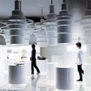
Split Column in the 1990s was similar in strategy and scale to the previous decade, if slightly more restrained. The Art Institute of Chicago Museum Store (1995) demonstrated the way that a light cove can act as the capital to a Split Column.42 The top had a different visual impact than most instances of Split Column, though, since it appeared to extend upwards rather than protruding down from the ceiling plane. The simple, modern aesthetic of this Split Column was part of a strategy for introducing refined design elements that would complement existing classically-inspired architectural details elsewhere in the space. This Split Column also incorporated lighting as many applications do, only this time with the diffuse glow of a light cove rather than an integrated light fixture.
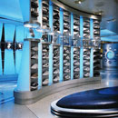
The triple combination of Split Column, Vitrine and Marching Order reappeared in the 1990s. The NikeTown (1997) stores have often employed museum and exhibit design practices in order to visually and experientially tell the Nike Story.43 The museum aesthetic was apparent in their use of Vitrine for isolating single sneakers on display, and arranging a series of them sequentially in Marching Order. When Split Column is of a smaller scale rather than spatial in nature, repetition has often been used to increase visual presence and impact. The solid-void relationship in Nike's case was heightened especially in the way that these columns were rowed up, since the repeated, adjacent solids and voids multiplied their effect. The form of the columns themselves further accentuated the effect of the Split Column. The cinched centers flanked by larger, glowing tops and bases focused even more attention on the central voids containing sneakers encased in glass. These vitrines thus provided further evidence for instances where the voids were enclosed in glass to still be considered instances of Split Column. The transparent vitrines meant that the columns were still visually missing a portion of their middles and therefore were "split."
Split Column was a recurring design tactic for Shu Uemura (1998), as the practice reappeared in their New York Store a little over a decade after the Paris store.44 The practice was again employed to define a makeup counter. A mirror wall was featured behind the counter, allowing the semi-circular forms to read as full circles much like Lapidus had done in Parcel Post in the 1940s. This "complete," cylindrical form was also reminiscent of the simple, bold forms from the 1970s. A Split Column of this nature that forms a counter, especially when applied to a store's cash wrap, would typically be instead considered an instance of Bottoms Up, since the void for a cash wrap counter would be intended for the activity of the sales exchange. Service counters, like Shu Uemura's make up counter or jewelry counters, however, can be considered with Split Column because they are designed for display, albeit a unique type of display that requires the assistance of a sales associate for its demonstration.
The most recent instances of Split Column have been the most exploratory, become increasingly sculptural and pushing the boundaries of the types of forms that can be used to achieve Split Column's solid/void effect. Fila, the classic Italian sportswear company, opened a New York flagship (2006) in an attempt to reinvigorate its brand.45 The store interior featured a dramatically sculptural Split Column as the focal point. The installation was a testament to the effectiveness of the Split Column even when applied to exceedingly organic or amorphous forms. Even with this type of organic form, it still acted as a solid top, central void, and solid base. The surface of the base corresponded with the top form's abutting surface in shape, proximity and orientation. Elaborating further on the column analogy, this Split Column could be perceived as akin to the Corinthian column in the way that its capital was fluted and ostentatious in comparison to the more conservative Doric and Ionic orders. In the context of a store trying to revive and reposition itself, Split Column became a unique, custom design solution that would have made for a memorable experience for customers and differentiated the brand in the marketplace.
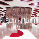
Galaxie Lafayette (2006) featured two elegant interpretations of Split Column.46 The first application was a Showcase Stair that was designed using the principles of Split Column. A series of layered, concentric circles that incrementally decreased in size as they progressed upwards formed the steps and were matched by a corresponding circular form on the ceiling. In an inverse relationship to the standard Split Column, a circular cut-out in the ceiling corresponded to the size of the bottom step, delineating an overall implied cylinder that contained the entire stair within it. Although Mannequins were displayed on the periphery of the void, it is interesting to consider the way that customers would have also become part of the display when on the stairs. Split Column was a motif throughout the store and was repeated in another display in the store, mimicking the overlapping circle pattern from the Showcase Stair. Related compositions of circles on the ceiling and for establishing the display surface below resulted in a compelling connection between the two parts. The high contrast between the white forms and the black floor and ceiling planes heightened the visual impact. Examples like Galaxie Lafayette's stair and custom display demonstrate the potential that innovative interpretations of Split Column hold for creating richer spatial experiences in retail interiors.
Both Fila and Mikimoto (2006) reiterated that the capital and base forms in Split Column do not need to be identical, as long as their adjacent faces were similar in size and shape.47 The Mikimoto store paired a stainless steel, cone-shaped pedestal with a cylindrical, nylon fringe shade above.48 This interpretation of the light in the top form functioned almost as a built-in lamp-shade. The void's small size relative to the height of the overall forms resulted in a concentrated focus on the items on display. Such situations suggest the power of the void to almost project an imaginary Vitrine around the merchandise, even if one was not there. A metaphorical Vitrine was implied in the way that the void similarly conveyed a message of "look but don't touch." The repetition of Marching Order (Intype) was used to enhance the visual impact of a smaller Split Column, in an alternative approach to the bold statement made by large, singular forms as in Fila. The resulting experience was more intimate, as the customer interacted with each display individually and sequentially rather than all at once as with a single large form.
An equally sculptural but entirely different interpretation of Split Column can be found in the approach taken by Novo (2008).49 Instead of single, solid forms, this Split Column was comprised of a series of hollow stainless steel tubes arranged in a cylindrical formation to create the top and bottom forms. The pattern was inspired by stalactite and stalagmite formations, mimicking their interplay of opposing downward and upward motions.50 Mannequins were displayed within. As with Galaxie Lafayette, a singular, sculptural Split Column made a bold statement without need for repetition. Customers could enter and engage with this one as with the Showcase Stair.
Patrick Cox (2009), a small handbag and accessories boutique in a Tokyo mall used Split Column essentially as the main design feature in the store.51 The forms continued the sculptural trend, reinterpreting the column with a cylinder made up of a series of rings of varying size. The pairing of Split Column and White Out resulted in a highly concentrated focus on the product. Thiis-Evensen's split motif was present again, directing all visual energy towards the items contained between the apparently sinking top and rising bottom forms.52 The effect was multiplied by the all-white palette, leaving the product as the only color in the space. Repetition of Split Column was visually compelling even when not arranged in Marching Order. Such scattered arrangement of form accentuated the ability to circulate entirely around the forms, lending themselves to an organic, circuitous circulation pattern.
A Nike store (2010) used pyramidal rather than cylindrical applications of Split Column.53 Vitrines rested on the bottom forms, but did not encapsulate the entire void as seen in previous examples. Split Column was this time repeated in a radial organization and fanned out in circle. In this case the intype was a strategy for highlighting table height vitrines. Although many stores make use of these types of table-height glass showcases, the pairing with a suspended vertical form more visibly marked their location in the store.
Conclusion
Split Column has become increasingly sculptural and complex in recent years as a custom, often architectural, display solution in the retail interior. A host of off-the-shelf display fixtures are available for furnishing retail interiors, so the personalization associated with opting for custom-designed display fixtures speaks to a retailers desire to create a tailored shopping experience for customers.54 Custom display techniques are inherently more expensive since they require the added cost of design and construction services. They also decrease the flexibility of a store compared to using all moveable fixtures that are easily reconfigurable for changing needs. Ultimately, Split Column has functioned as a spatially integrated, sculptural display solution that sets retail interiors apart from those that rely primarily on existing display fixturing sold on the market. The vertical nature of Split Column inherently draws attention to itself within the spatial composition of the store as a whole, and then transfers that attention to the products contained within. The custom nature of the display allows it to not only align with the image that a brand wishes to create, but it affords designers and retailers a level of control over customer interaction with product. Beyond the overall interior experience in a store, Split Column has evolved from a strategy for framing the service relationship between sales associate and customer over a counter to a means for crafting the individual interaction the customer has with the product on display.55
end notes
- 1) Francis D.K. Ching, Architecture: Form, Space and Order (New York: John Wiley & Sons, Inc., 1996), 48.
- 2) Francis D.K. Ching, Interior Design Illustrated (Hoboken, NJ: John Wiley & Sons, Inc., 2005), 120.
- 3) Otto Ocvirk, et al, Art Fundamentals: Theory and Practice (New York: McGraw Hill, 2006), 91.
- 4) Ocvirk et al, Art Fundamentals, 40.
- 5) Ching, Interior Design Illustrated, 142-43.
- 6) Thomas Thiis-Evensen, Archetypes in Architecture (New York: Oxford University Press, 1987), 129, 197.
- 7) Thiis-Evensen, Archetypes in Architecture, 135.
- 8) Stash [2005] Maurice Mentjens; Maastricht, Netherlands in Tessa Blokland, Dress Code: Interior Design for Fashion Shops (Amsterdam: Frame Publishers, 2006), 85, 87; PhotoCrd: Arjen Schmitz.
- 9) Thiis-Evensen, Archetypes in Architecture, 137.
- 10) Isaac Mizrahi for Target Pop-Up Store [2003] Work Architecture; New York City in Ian Luna, Retail: Architecture and Shopping (New York: Rizzoli, 2005), 234-35; PhotoCrd: Courtesy of Work Architecture.
- 11) Emily M. Mauger, Modern Display Techniques (New York: Fairchild Publications, Inc., 1964), 38.
- 12) Martin M. Pegler, Visual Merchandising and Display (New York: Fairchild Publications, 2006), 17-20, 75.
- 13) Pegler, Visual Merchandising and Display, 22.
- 14) Mauger, Modern Display Techniques, 28.
- 15) Claire Walsh, "Shop Design and the Display of Goods in Eighteenth-Century London," Journal of Design History 8, no. 3 (1995): 157.
- 16) This was not necessarily true in Europe. For example, Adolf Loos designed the interiors for several specialty shops around the beginning of the 20th century.
- 17) Jose A. Fernandez, The Specialty Shop (A Guide) (Cornwall, NY: Architectural Book Publishing Co., Inc., 1955), 14.
- 18) Fernandez, The Specialty Shop, 14.
- 19) Bryan P. Westwood and Norman C. Westwood, Smaller Retail Shops (London: The Architectural Press, 1937), 9.
- 20) Sophie Dubuisson-Quellier, "The Shop as Market Space: The Commercial Qualities of Retail Architecture," eds. David Vernet and Leontine de Wit, Boutiques and Other Retail Spaces: The Architecture of Seduction, (New York: Routledge, 2007), 20-22.
- 21) Dubuisson-Quellier, "The Shop as Market Space," 24.
- 22) Claudio Marenco Mores, From Fiorucci to the Guerilla Stores: Shop Displays in Architecture, Marketing and Communications (Milan: Marsilio, 2006), 73.
- 23) Mores, From Fiorucci to the Guerilla Stores, 87.
- 24) Parcel Post [1946] Morris Lapidus; New York City in Deborah Desilets, Morris Lapidus: The Architecture of Joy (New York: Rizzoli, 2010), 136-37; PhotoCrd: Morrsi Lapidus Archives.
- 25) Ching, Interior Design Illustrated, 120.
- 26) Simco Shoes [1950] Gibbons & Heidtmann; Jamaica, NY in Anonymous, "Customer Lure for Shoe Chain," Architectural Record 107, no. 3 (Mar. 1950): 94-96; PhotoCrd: Lionel Freedman: Pictor.
- 27) Carol Antell [1952] Seymour R. Joseph, Joseph and Vladeck; New York City in Anonymous, "Expanding Store Creates Design Problem," Architectural Record 111, no. 2 (Feb. 1952): 156-62; PhotoCrd: Ben Schnall.
- 28) Anonymous, "Expanding Store Creates Design Problem," 162.
- 29) Carson, Pirie, Scott & Co. [1964] Hal Lorey, A.I.D., Stonehedge Interiors; Shelby, KY in Anonymous, "Portfolio of Work: by Members of the Ohio South Kentucky Chapter," Interior Design 35, no. 9 (Sept. 1964): 126; PhotoCrd: Town & Country.
- 30) Lehman-Saunders [1971] Joseph Braswell; Manhasset, NY in Anonymous, "Work by AID Members: Joseph Braswell," Interior Design 42, no. 8 (Aug. 1971): 130-31; PhotoCrd: Martin Hefler.
- 31) Anonymous, "Work by AID Members," 130.
- 32) Neiman Marcus [1975] Eleanor Le Maire Associates, Inc., interior designer; Jonh Carl Warnecke & Associates architect; St. Louis, MO in Anonymous, "Two Stores: Both the Work of the Same Design Firm, Bergdorf Goodman (White Plains) and Neiman Marcus (St. Louis) Posed Different Problems and Required Disparate Solutions," Interior Design 46, no. 4 (Apr. 1975): 150-61; PhotoCrd: Martin Helfer.
- 33) Anonymous, "Two Stores," 157.
- 34) Miller's, Inc. [1976] Omniplan; Bristol, VA in Anonymous, "Miller's, Inc.: Omniplan Develops a Comprehensive Modular Fixturing System for a Branch Department Store Located in Bristol, VA," Interior Design 47, no. 6 (Jun. 1976): 134-39; PhotoCrd: Dan Hatzenbuehler; Frank Kelly.
- 35) Troa Cho [1983] Alfredo De Vido; New York City in J.G.T., "Playful Enterprise: Architect Alfredo De Vido Converts the Ground Floor of a 19th-Century Manhattan Townhouse Into a Clothing Boutique," Interior Design 54, no. 9 (Sept. 1983): 254-55; PhotoCrd: Paul Warchol.
- 36) Charrette Store [1984] Olson Lewis Architects & Planners, Inc.; New Haven, CT in Loring Leifer, "A Temple of Ideas: The Judges Deem the Newest Charette Store by Olson Lewis a Witty Resolution of the Conflict Between Architecture and Product Display," Interiors 143, no. 1 (Jan. 1984): 170-71; PhotoCrd: Steve Rosenthal.
- 37) Leifer, "A Temple of Ideas," 171.
- 38) Leifer, "A Temple of Ideas," 171.
- 39) Thiis-Evensen, Archetypes in Architecture, 135.
- 40) Thiis-Evensen, Archetypes in Architecture, 201.
- 41) Shu Uemura [1986] Jean-Louis Véret and Gérard Ronzatti; Paris, France in Brigitte Fitoussi, Les Boutiques (Paris, Electa Moniteur, 1988), 70-73; PhotoCrd: Anonymous.
- 42) The Art Institute of Chicago Museum Store [1995] Powell/Kleinschmidt; Chicago, IL in MJ Madigan, "Museum Shop: Attentive to Classic Detailing, Powell/Kleinschmidt Reworks a Museum Shop for More Space and Better Flow," Interiors 154, no. 12 (Dec. 1995): 68-71; PhotoCrd: Jon Miller/Hedrich-Blessing.
- 43) Niketown [1997] Nike Design Team (architectural, media, and Conceptual design); Brian McFarland, Michael LeClere; BOORA Architects; New York City in Virginia Kent Dorris, "Nike's Flagship Store Integrates Architecture Into an All-Encompassing Brand-Reinforcing Experience," Architectural Record: Record Interiors 185, no. 3 (Mar. 1997): 100-103; PhotoCrd: Steve Hall, Marco Lorezetti/Hedrich-Blessing; Dorris, "Nike's Flagship Store," 102.
- 44) Shu Uemura [1998] M.I.C.; New York City in Monica Geran, "Face Value: To Prove That Good Design and Location Make a Difference, M.I.C. Creates a Soho-Dased Showroom for Shu Uemura Cosmetics," Interior Design 69, no. 5 (Apr. 1998): 192-95; PhotoCrd: Paul Warchol.
- 45) Fila [2006] Giorgio Borruso; New York City in Craig Kellogg, "Fila's Grand Slam: Giorgio Borruso Puts Some Major Topspin on a New York Flagship, the Prototype for an International Rollout," Interior Design 77, no. 4 (Apr. 2006): 210-15; PhotoCrd: Benny Chan/Fotoworks.
- 46) Galaxie Lafayette [2005] Plajer & Franz Studio; Berlin, Germany in Blokland, Dress Code: Interior Design for Fashion Shops, (Amsterdam: Frame Publishers, 2006): 283-84; PhotoCrd: diephotodesigner.de.
- 47) Mikimoto [2006] Ichiro Nishiwaki, interior designer; Toyo Ito, architect; Tokyo, Japan in Masaaki Takahashi, "A Window on Luxury: Toyo Ito's Building Lets Tokyo Glimpse Mikimoto Pearls in the Perfect Setting, an Interior by Ichiro Nishiwaki," Interior Design 77, no. 4 (Apr. 2006): 192-99; PhotoCrd: Jimmy Cohrssen.
- 48) Kellogg, "A Window on Luxury," 196.
- 49) Novo [2008] Studio 63 Architecture + Design; Hong Kong, China in Mark McMenamin, "All Dressed Up: No Place To Go? Follow the Fashionistas from Paris to Hong Kong and Beyond," Interior Design 79. no. 4 (Apr. 2008): 266-81; PhotoCrd: Yael Pincus.
- 50) McMenamin, "All Dressed Up," 270.
- 51) Patrick Cox [2009] Sinato; Tokyo, Japan in Benjamin Budde, "Walk Through: The Halo Effect," Interior Design 80, no. 9 (Jul. 2009): 55-56; PhotoCrd: Nacása & Partners.
- 52) Thiis-Evensen, Archetypes in Architecture, 135.
- 53) Nike [2010] Wonderwall; Tokyo, Japan in Meghan Edwards, "Global Shopper: Flagship, Boutique or Showroom-The World Is Our Marketplace," Interior Design 81, no. 4 (Apr. 2010): 188-201; PhotoCrd: Kozo Takayama.
- 54) Rodney Fitch and Lance Knobel, Retail Design (New York: Whitney Library of Design, 1990), 44.
- 55) Evidence for the archetypical use and the chronological sequence of Split Column in retail interiors was developed from the following sources: 1940 Parcel Post [1946] Morris Lapidus; New York City in Deborah Desilets, Morris Lapidus: The Architecture of Joy (New York: Rizzoli, 2010), 136-137; PhotoCrd: Morrsi Lapidus Archives / 1950 Simco Shoes [1950] Gibbons & Heidtmann; Jamaica, NY in Anonymous, "Customer Lure for Shoe Chain," Architectural Record 107, no. 3 (Mar. 1950): 95; PhotoCrd: Lionel Freedman: Pictor; Carol Antell [1952] Seymour R. Joseph, Joseph and Vladeck; New York City in Anonymous, "Expanding Store Creates Design Problem," Architectural Record 111, no. 2 (Feb. 1952): 162; PhotoCrd: Ben Schnall / 1960 Carson, Pirie, Scott & Co. [1964] Hal Lorey, A.I.D., Stonehedge Interiors; Shelby, KY in Anonymous, "Portfolio of Work: by Members of the Ohio South Kentucky Chapter," Interior Design 35, no. 9 (Sept. 1964): 126; PhotoCrd: Town & Country / 1970 Lehman-Saunders [1971] Joseph Braswell; Manhasset, NY in Anonymous, "Work by AID Members: Joseph Braswell," Interior Design 42, no. 8 (Aug. 1971): 130; PhotoCrd: Martin Hefler; Neiman Marcus [1975] Eleanor Le Maire Associates, Inc., interior designer; Jonh Carl Warnecke & Associates architect; St. Louis, MO in Anonymous, "Two Stores: Both the Work of the Same Design Firm, Bergdorf Goodman (White Plains) and Neiman Marcus (St. Louis) Posed Different Problems and Required Disparate Solutions," Interior Design 46, no. 4 (Apr. 1975): 160; PhotoCrd: Martin Helfer; Miller's, Inc. [1976] Omniplan; Bristol, VA in Anonymous, "Miller's, Inc.: Omniplan Develops a Comprehensive Modular Fixturing System for a Branch Department Store Located in Bristol, VA," Interior Design 47, no. 6 (Jun. 1976): 134; PhotoCrd: Dan Hatzenbuehler; Frank Kelly / 1980 Troa Cho [1983] Alfredo De Vido; New York City in J.G.T., "Playful Enterprise: Architect Alfredo De Vido Converts the Ground Floor of a 19th-Century Manhattan Townhouse Into a Clothing Boutique," Interior Design 54, no. 9 (Sept. 1983): 255; PhotoCrd: Paul Warchol; Charrette Store [1984] Olson Lewis Architects & Planners, Inc.; New Haven, CT in Loring Leifer, "A Temple of Ideas: The Judges Deem the Newest Charette Store by Olson Lewis a Witty Resolution of the Conflict Between Architecture and Product Display," Interiors 143, no. 1 (Jan. 1984): 171; PhotoCrd: Steve Rosenthal; Shu Uemura [1986] Jean-Louis Véret and Gérard Ronzatti; Paris, France in Brigitte Fitoussi, Les Boutiques (Paris, Electa Moniteur, 1988), 71-72; PhotoCrd: Anonymous / 1990 The Art Institute of Chicago Museum Store [1995] Powell/Kleinschmidt; Chicago, IL in MJ Madigan, "Museum Shop: Attentive to Classic Detailing, Powell/Kleinschmidt Reworks a Museum Shop for More Space and Better Flow," Interiors 154, no. 12 (Dec. 1995): 68; PhotoCrd: Jon Miller/Hedrich-Blessing; Niketown [1997] Nike Design Team (architectural, media, and Conceptual design); Brian McFarland, Michael LeClere; BOORA Architects; New York City in Virginia Kent Dorris, "Nike's Flagship Store Integrates Architecture Into an All-Encompassing Brand-Reinforcing Experience," Architectural Record: Record Interiors 185, no. 3 (Mar. 1997): 102; PhotoCrd: Steve Hall, Marco Lorezetti/Hedrich-Blessing; Shu Uemura [1998] M.I.C.; New York City in Monica Geran, "Face Value: To Prove That Good Design and Location Make a Difference, M.I.C. Creates a Soho-Dased Showroom for Shu Uemura Cosmetics," Interior Design 69, no. 5 (Apr. 1998): 192; PhotoCrd: Paul Warchol / 2000 Stash [2005] Maurice Mentjens; Maastricht, Netherlands in Tessa Blokland, Dress Code: Interior Design for Fashion Shops (Amsterdam: Frame Publishers, 2006), 85, 87; PhotoCrd: Arjen Schmitz; Galaxie Lafayette [2005] Plajer & Franz Studio; Berlin, Germany in Tessa Blokland, Dress Code, 283, 284; PhotoCrd: diephotodesigner.de; Mikimoto [2006] Ichiro Nishiwaki, interior designer; Toyo Ito, architect; Tokyo, Japan in Masaaki Takahashi, "A Window on Luxury: Toyo Ito's Building Lets Tokyo Glimpse Mikimoto Pearls in the Perfect Setting, an Interior by Ichiro Nishiwaki," Interior Design 77, no. 4 (Apr. 2006): 196; PhotoCrd: Jimmy Cohrssen; Fila [2006] Giorgio Borruso; New York City in Craig Kellogg, "Fila's Grand Slam: Giorgio Borruso Puts Some Major Topspin on a New York Flagship, the Prototype for an International Rollout," Interior Design 77, no. 4 (Apr. 2006): 213; PhotoCrd: Benny Chan/Fotoworks; Novo [2008] Studio 63 Architecture + Design; Hong Kong, China in Mark McMenamin, "All Dressed Up: No Place To Go? Follow the Fashionistas from Paris to Hong Kong and Beyond," Interior Design 79. no. 4 (Apr. 2008): 271; PhotoCrd: Yael Pincus; Patrick Cox [2009] Sinato; Tokyo, Japan in Benjamin Budde, "Walk Through: The Halo Effect," Interior Design 80, no. 9 (Jul. 2009): 56; PhotoCrd: Nacása & Partners / 2010 Nike [2010] Wonderwall; Tokyo, Japan in Meghan Edwards, "Global Shopper: Flagship, Boutique or Showroom-The World Is Our Marketplace," Interior Design 81, no. 4 (Apr. 2010): 193; PhotoCrd: Kozo Takayama.
bibliographic citations
1) The Interior Archetypes Research and Teaching Project, Cornell University, www.intypes.cornell.edu (accessed month & date, year).
2) Malyak, Kristin. Split Column, "Theory Studies: Archetypical Retail Practices in Contemporary Interior Design," M.A. Thesis, Cornell University, 2011, 296-330.