Colorbrand
Colorbrand is a brand strategy characterized by the use of color in an interior space as an explicit representation of the space's brand identity. This color is most often derived from the company logo or graphic identity and is the principal color or colors used on an otherwise neutral interior palette. This strategy is used at all levels of the strategic continuum of brand intervention (Understate, Activate, Saturate). more
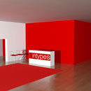
Colorbrand | Spatial Graphic Design
research
In receiving and interpreting sensory stimuli from the world around us, our brains rely most heavily on visual inputs-with upwards of 80% of our sensory inputs being visual. Thus, the associations and perceptions triggered by color play an essential role in our experience of and interaction with our surroundings. "Color is, in some sense, most closely related to music. They both have rhythm and harmony and are used to add emphasis and feeling. They can play directly on our sense and emotions and bypass our conscious minds, or they can be used for purely intellectual pursuits. There is a poetic aspect to each that can be hard to define."1
Color has always been heavily imbued with meaning. It helped our primitive ancestors distinguish between foods that were safe to eat and those that were potentially poisonous or spoiled. Color is a symbol of status and wealth, a mark of belonging to various groups, and a symbol to mark rites of passage. Used to mark family crests, accompany religious rites, differentiate nationalistic flags, and designate teams, we rely on color as a means to both distinguish ourselves from one another and as a symbolic entity under which we can come together.
Research shows that our response to color is total, with both emotive and physiological effects. Color's healing therapies are used in both traditional medicine and alternative therapies. Studies find that spectral reds are more likely to increase skin temperature, raise blood pressure and elevate respiration, while opposing blues are more calming, lowering blood pressure, pulse and respiration.2 These cooler blues and greens are also found to be more welcoming, making it easier for individuals to adjust to new surroundings. For these reasons, use of these cool colors is explored in medical settings as a means to bring calm to what is usually a stressful and uncertain environment.
In contrast, warmer colors make for a more highly stimulated environment and can even have an effect on our relationship with food and our appetites. The physiological stimulation from the bold, hot hues that McDonald's, Burger King or Wendy's all use-all bright yellows, reds and oranges-are no accident. These colors increase appetite and speed of consumption, ideal for fast food settings where increased purchasing and high rates of turnover are a key part of the business model. And from a retail standpoint, a remarkable 60% of a consumer's decision to buy a product is based on color alone.3
The emotive properties and physiological responses to color are now being actively harnessed as a branding tool. In studying the sequence of perception, scientists have documented the order in which the brain receives and interprets sensory stimuli-first shape, then color, and, finally, linguistic form.4 This knowledge of our neural hierarchies shapes the way companies approach branding. Having the power to evoke emotion and convey personality, color plays an integral role in the construction of a visual identity. In developing a brand vocabulary, colors can be both unifying-tying together an overall brand-or used to distinguish various areas of brand architecture-subsidiary brands, different departments, various flavors, etc. Families of color are developed around the primary palette developed for the logo and logotype, and are often translated into marketing materials, packaging, and spatial environments.
This translation of brand aesthetic to interior environment creates a spatial expression of the brand narrative, connecting individuals in the space to the brand identity in a more immersive and emotive way.
Chronological Sequence
It is worth noting that in my content survey of Interior Design, articles were printed in black and white through the late 1960s making this Intype a challenging one to document in trade sources prior to that time. Additionally, the logos accompanying some examples (primarily from earlier decades) were unavailable. Therefore, visual analysis for these examples is based solely on the images provided.
Once color photography is introduced to design trade journals, one of the earliest instances of Colorbrand is found in Chicago's 1971 PDQ Carry Out restaurant.5 The fast-service, carry out restaurant is a fairly understated space, with neutral tile walls and laminate wood booth seating. Floor tiles are much darker, but equally neutral in color. The only areas where color is introduced to this space is in the laminate table-tops and half-height partition walls separating the two rows of booths, as well as pendant lamps overhead.
In all of these instances, the color remains the same - red. The use of this bold, primary color aligns with findings that warmer, brighter colors increase appetite and rate of consumption, fitting for this fast food environment. While no single iteration of the restaurant's logo is found in the article, it can be seen tiled in white block letters in a single row running across a full-height glass partition that separated the booth seating from a sprinkling of smaller, round, freestanding tabletops towards the front of the space. The white PDQ logo is again seen in the foreground of the photograph on red cups sitting on one of the booth's tables. Although the logo itself is never shown as a standalone entity, it can be inferred from its use on the red cups and in the context of the red booths that the white text of the logo is meant to be understood in conjunction with the color red.
The following year, a Franklin Simon department store makes a bold statement with their Atlanta location.6 Visitors are greeted with an expansive wall of rich, vibrant purple, embellished with a larger than life image of a butterfly, fashioned from vertical metallic strips. Immediately next to this decorative butterfly silhouette is the store's name, printed in white text that is accentuated by the deep purple of the wall. Below, two benches are placed, upholstered in the same purple as the wall behind them. This seating element mimics the gentle curves of the large butterfly with its organic, rolling form. From this point of entry, customers move down a wide corridor towards the open department store floor. This corridor, as well as a series of columns that follow, are also painted in the vivid hue first introduced at the store's entrance.
Purple eventually gives way to white, which remains the predominant backdrop for the remainder of the space, allowing the products and their displays to stand at the fore of the customer's shopping experience. Despite this more neutral environment, the rich purple of the store's entrance is not abandoned all together. The vibrant benches first positioned under the store name are also scattered throughout the overall floor plate, peppering the otherwise White Out7 interior with regular splashes of color. For a retailer that houses countless brands, using Colorbrand to establish a cohesive undercurrent of self-identity throughout the store helps maintain a sense of place for customers and also reaffirms the Franklin Simon brand first introduced with the initial purple wall.
A 1986 Haworth showroom takes a more understated approach to the Colorbrand strategy.8 There are no floor-to-ceiling walls of flashy color, and yet the space, although outfitted primarily in various neutral tones, is not without hints of the Haworth logo. A series of red metal frames crawl along the perimeter of the space creating a visual border for the row of columns that lay directly behind them. The conjoining edges of the frames meet one another at an acute angle, forming a zigzag reminiscent of the "w" in Haworth's own logo. In the circulation space in front of these columns, the carpet is dotted with red triangles at regular intervals. These accentuate the red motif starting with the metal frames and also reiterate the angle formed at the frames' juncture. This Haworth red is also subtly woven into the space by way of the frame for the suspended ceiling tiles. This use of Colorbrand, although much more subtle than that of Franklin Simon, allows the color and angles drawn from the text of Haworth's logo to activate the space.9
The distinctive color palette of design firm Osgood & Associates' corporate logo proves to be a highly successful unifying element in the space. The emblem, a "cobalt blue O and a splintered triangle, the latter vaguely suggestive of an ampersand and the former streaked with chrome yellow", 10 is situated prominently in the firm's lobby, serving as an introductory element to those entering the space. The cobalt and chrome yellow are used consistently throughout the firm's interior, from the vibrant blue receptionist's desk to the sunny panel of pivot-hinged doors leading into an adjacent conference room. Private offices are outfitted with tasteful yellow chairs, and vertical drywall partitions of the same hue rhythmically punctuate the workstations on the open office floor. For the budget conscious start-up firm, this exploration of Colorbrand offers a low-cost approach to unifying the space and doubly served to enforce their newfound brand identity.
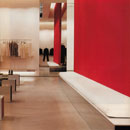
Luxury brand Miu Miu takes a similar approach in both its Los Angeles and Paris stores, creating a signature aesthetic that remained relevant to the brand for years.11 The younger sister of Prada, Miu Miu boutiques hold consistent image paramount. Adopting a striking vermillion as its trademark color, Miu Miu's otherwise understated palette of black, white, aluminum and concrete is graced with splashes of the brilliant red. For the brand's creator, Miuccia Prada (also the head of Prada), a principal goal in the design of the space is to create an original yet subdued interior that allows the product to take center stage.
Although the architecture and space planning remain simplified and minimalist, designers look to the brand's signature color as an opportunity to add drama and character to the interior. Panels of the vibrant red hang suspended just above the floor plane and are anchored deep in recessed cavities in the fourteen-foot ceilings, creating the illusion that they are hovering in the space. These panels, as well as several full-height white walls, are affixed with metal bars bearing a select number of hanging garments. Low-lying display fixtures within the space are polished aluminum rectangular prisms topped with accessories, shoes, and a sparse sampling of folded garments. Almost as if is to be kept secret, the red lining of these display units only reveal itself to passersby when viewed from a certain vantage point, a restrained reiteration of larger panels of red elsewhere in the store. For a space where "product supremacy" reigns, moments of Miu Miu's signature vermillion make the experience of the unadorned interior dramatic and memorable.
Qiora, a spa and skincare products line, touts its focus on the connection between body and mind as the key to reaching a state of deep and pure relaxation.12 The complete line of cleansers, serums and lotions are all packaged in gentle shades of cerulean derived from the company's simple, delicate logo. The Japanese skincare brand has recently expanded to locations throughout the United States, bringing to each store a consistent interior aesthetic unified around the product's packaging. The Madison Avenue location boasts a double-height glass façade, allowing for full display of the gracefully outfitted interior from the exterior.
The otherwise white space is partitioned by full-height organza panels, suspended from the ceiling in shades of blue and aqua. The gently curving planes of fabric meander through the center of the space, complimenting round pedestal tables displaying samplings of products and implying organic circulation paths through the rectangular space. Additional display is reserved for the interior's perimeter, with products dotting a series of low profile shelves carrying the same shades of blue to the white walls. The space feels immediately calm and relaxed, with the wash of blues working doubly as both a reiteration of the brand's color and as a psycho-physiological tool to shape visitors' experience of the store. Cool colors, such as blues and greens, are shown to elicit more relaxed emotive responses from individuals who are exposed to or surrounded them, making such colors a fitting choice for a store whose products work to promote sense of well being and inner balance.
When CNET Networks decided to consolidate its scattered locations into one centralized headquarters, the San Francisco media company took the change as an opportunity to rebrand itself.13 Visitors to the space are first introduced to the company's new logo-a vibrant, red-orange circle with a glowing backlit glass panel situated behind the receptionist's desk. With the guidance of Gensler, the corporate color ultimately becomes a unifying element in the interior, used on various scales throughout the remainder of the space. Employee workstations are outfitted with detachable shelving, filing cabinets and other desk accessories, all in the same brilliant red-orange. Two stories of conference rooms are stacked atop one another, circled on three sides by a curved wall painted the trademark CNET color and fronted with glazing that overlooked a double-height staff lounge. Dropped soffits in an upper level conference room are also painted red-orange, an inconspicuous use of the color visible primarily from outside the building through the large panes of glass on the building's façade. Smaller applications of the color include an understated wayfinding system and the upholstery on a selection of chairs, making the total experience of the company's new space and fresh brand identity both cohesive and distinct.
The unmistakable lemon-yellow of Catherine Malandrino's New York boutique makes the space a standout on its corner lot in New York's meatpacking district.14 In what was once an abandoned warehouse, a graceful, C-shaped banquette is now upholstered in vibrant yellow leather, and translucent acrylic display towers of the same color showcased the brand's stylish accessories. A twenty-six foot feature wall, shingled in golden mirrors, snakes its way through the space repeatedly reflecting the various yellow elements and adding a sparkling contrast to the raw structural elements left exposed in the interior retrofit. Full-height lacquered glass and a lemon colored half-wall towards the rear of the space complete the sunny interior of the sophisticated boutique, setting a colorful stage for the store's high-end apparel.
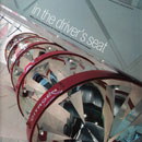
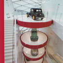
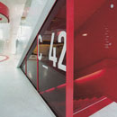
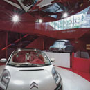
Fast cars and the color red go hand in hand, as exhibited in Citroën's Paris showroom. The carmaker, founded in France in 1919, quickly earned a reputation for its creativity and engineering prowess. The design of this 2008 showroom on the Champs-Elysées, demands a bit of ingenuity of its own. Being a tall but very narrow space by showroom standards, with a footprint of thirty-six feet wide by 110 feet deep and a 115 foot atrium,15 designers at Manuelle Gautrand Architecture are presented with the challenge of how to best display the vehicle's despite spatial constraints.
The impressive solution comes in the form of a "tree of cars" situated in the five-story atrium space clearly visible from the street. This "tree" is really a oversized column of sorts, made up of eight circular platforms stacked vertically in the atrium, each supporting a unique make of Citroën car. The outer rim of these platforms, as well as the support column to which each is affixed at the rear, are the shiny, lacquered red of the company's logo. As if the structure is not remarkable enough on its own, the base of each platform also rotates in place, showcasing the cars from every angle and adding an extra ounce of dynamism to the space. From the ground level, a glass enclosure reveals stairs to the showroom's basement, completely colored in the company's fire-engine red. Several chevrons of red tinted glass, referencing the Citroën logo, are interspersed throughout the almost 7,000 square-feet of glass used in the space. The rest of the space is clad entirely in a shiny white, the logo's compliment to its vibrant red. Although the brand's logo has since been re-envisioned to mark the company's 90th anniversary in February of 2009, it retains the signature red of its predecessor.
Arguably one of the most iconic brand colors is Barbie pink. Mattel's toy fashion doll, launched in March of 1959, has become one of the most famed and beloved toys of all time. The script text of the logo varies slightly over the decades, but its signature Barbie Pink (Pantone 219) remains a constant. Designed in 2009 in commemoration of Barbie's 50th anniversary, a six story Shanghai flagship is the first store of its kind to be dedicated solely to the iconic doll. From the lobby of the former office building, visitors travel via an escalator tunnel, whose white walls are illuminated by pink neon lights, to the main floor of the store. From here, a double-height atrium can be traversed by way of a large spiral staircase whose enclosure is made up of stacked, clear acrylic boxes reminiscent of Barbie's packaging.16 Each Vitrine17 is home to a different doll, each dressed, naturally, in pink. This motif of transparent material coupled with Barbie Pink is echoed in the building's impressive glass façade that glows pink from within come nightfall. Plush pink carpeting and pink lacquered shelving units are used throughout the playful, fantasy dream house. The space is over-the-top pink, and appropriately so, as an all-encompassing celebration of the iconic doll.
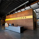
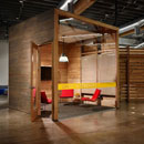
The Lance Armstrong Foundation (LAF) was established in 1997 by World Champion cyclist Lance Armstrong after his battle with advanced testicular cancer. The foundation supports and advocates for the cancer community for more than a decade, raising awareness and offering a multitude of community resources. The foundation's hugely popular 2004 "Wear Yellow Live Strong" yellow wristband campaign made Livestrong a household name, selling over 70 million wristbands to date and raising well over its target goal of $25.1 million. Five years later, the Lance Armstrong Foundation officially began going simply by the name Livestrong, and with renaming came a relocation to Texas. The new Livestrong Headquarters, located in one of Austin's most diverse neighborhoods, was designed by architecture firms Lake-Flato and the Bommarito Group as the area's first gold-certified LEED facility.18 Using the existing building foundation, and repurposed floor and ceiling wood to name a few, literally tons of existing on-site materials are reused in the new building.
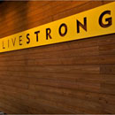
The interior is humble and understated, with polished concrete slab flooring and exposed services at the ceiling. Reconstituted wood boards enclose small, free-standing meeting rooms that dot the interior, and also make up a horizontally paneled wall behind the reception desk. It is here, immediately upon entry into the space, that visitors are first introduced to the foundation's signature yellow color. Even the application itself is reminiscent of the Livestrong wristbands that made the color so famous. The color runs the length of the wall in a horizontal band engraved with the Livestrong name-a larger than life replica of the popular wristbands. A similar yellow stripe is applied to the glass panels that makes up the fourth wall of the various meeting rooms with a vinyl appliqué. Here, the Livestrong name used in the lobby is replaced with cutouts of inspirational phrases emphasizing "Knowledge Is Power", "Strength In Unity" and "Attitude Is Everything". The iconic color is used again in a bold proclamation of the foundation's manifesto, the yellow coloring a block of text that spoke of unity, strength and hope. This simple but memorable motif becomes a unifying element throughout the interior, connecting visitors to not only the space, but also to the foundation's mission and identity.
Prior to 2006, both AT&T and Cingular Wireless had independently strong and distinct graphic identities. AT&T, Inc. is one of the longest standing telecommunication companies in America, founded in 1885 as the American Telephone & Telegraph Company. Although the company's mobile wireless arm didn't come into existence until 2000, the company has been a staple on the telecommunications scene for decades. Its infamous blue "world globe" logo is designed in 1984 by Saul Bass20, replacing the dated bell logo that the company had been using for almost a century. 19 A slightly more modern take on the striated sphere is implemented in 2005, maintaining the signature blue.
A much younger company, Cingular's signature orange color is first introduced with the company's bulbous "X" logo, first conceived with the company's founding in 2000 as a joint venture between SBC Communications and BellSouth. In a 2006 merger, the two companies become one, both now operating under the name AT&T. In the year or so leading up to the telecomm union, subtle marketing tactics are employed to gradually marry the two brands. Cingular begins by introducing AT&T's signature blue into the color palette of its logo, changing what was formerly black text to the more vibrant hue.
Around this time, Cingular also changes its slogan from "Fits You Best" to "Raising The Bar", readying for a fresh ad campaign to introduce the AT&T merger, while simultaneously alluding to the raised standards and improved service that the merger would bring. The widely popular "Raising The Bar" campaign plays on the company's new tagline as well as the tagline's graphic accompaniment-five incrementally increasing bars, a nod to the standard industry icon for a full cellular signal. A series of commercials capture a "real world" series of five bars with each pan of the camera-five sequential buildings in a skyline, five jets of water shooting out of a fountain, towels folded and neatly stacked side by side in five piles-all mimicking the cell signal emblem. A male voiceover concludes: "More bars in more places, thanks to Cingular and AT&T Wireless joining forces. Welcome to the new Cingular, we're raising the bar." Gradually, this sign-off became "Cingular, now the new AT&T", and finally "AT&T, Rethink Possible" as the two become a fully integrated entity.
This gradual assimilation is a marked effort to ease consumers into the new company image and an attempt to maintain brand loyalty despite the obvious changes from both sides. Even now, although the Cingular name is completely out of the picture, the new AT&T maintains the former brand's trademark orange and uses it in many of its stores as the primary color for walls, signage and packaging. The story of these two wireless giants is thoughtfully colored, promising a resilient future for the new brand.
Colorbrand is one of the most widely used Spatial Graphic Design strategies, whose application can be scaled for use on all levels of the strategic continuum of brand intervention.20
end notes
- 1) Steven Bleicher, Contemporary Color Theory & Use (Clifton Park, NY: Thomson/Delmar Learning, 2005), xv.
- 2) Bleicher, Contemporary Color Theory & Use, 36-44.
- 3) Alina Wheeler, Designing Brand Identity: An Essential Guide for the Entire Branding Team (Hoboken, NJ: John Wiley & Sons, Inc., 2009), 128.
- 4) Wheeler, Designing Brand Identity, 52.
- 5) PDQ Carry Out [1971] ISD, Inc.; Chicago, IL in Anonymous, "Concourse Level Restaurants," Interior Design 42, no. 10 (Oct. 1971): 125-26; PhotoCrd: Idaka.
- 6) Franklin Simon [1972] George Nelson & Co.; Atlanta, GA in Anonymous, "Franklin Simon," Interior Design 43, no. 4 (Apr. 1972): 121; PhotoCrd: Alexandre Georges.
- 7) White Out describes a space in which all planar surfaces (wall, ceiling, floor), as well as furnishings and furniture are a bleached, bright white. It has been identified in Boutique Hotel, Resort & Spa, Restaurant and Retail practice types. Jasmin Cho, "Theory Studies: Archetypical Practices of Contemporary Restaurant Design," (M.A. Thesis, Cornell University, 2009), 38-45; Rachel Goldfarb, "Theory Studies: Archetypical Practices of Contemporary Resort and Spa Design," (M.A. Thesis, Cornell University, 2008), 52-59; Kristin Malyak, "Theory Studies: Archetypical Retail Practices in Contemporary Interior Design," (M.A. Thesis, Cornell University, 2011), 202-31; Mijin Juliet Yang, "Theory Studies: Contemporary Boutique Hotel Design," (M.A. Thesis, Cornell University, 2005), 92- 94.http://www.intypes.cornell.edu/intypesub.cfm?inTypeID=50 (accessed Sep. 9, 2011).
- 8) Design Center Northwest Haworth Showroom [1986] Wyatt Stapper Architects; Seattle, WA in Anonymous, "Haworth, Seattle," Interior Design 57, no. 7 (Jul. 1976): 233; PhotoCrd: Robert Pisano.
- 9) Activate is a brand concept that occupies the middle condition of a strategic continuum ranging from the least intervention (Understate) to the most persistent and pervasive (Saturate). In the activated condition, applications of the brand vocabulary are distributed throughout the space on various scales and elements, often positioned strategically to get the highest impact from the most important locations in space, creating an active and dynamic experience of the brand narrative. Juliana Daily, "Theory Studies: Archetypical Spatial Graphic Design Practices in Contemporary Interior Design," M.A. Thesis, Cornell University, 2012, 80-97.
- 10) Osgood & Associates [1990] Osgood & Associates; Atlanta, GA in Monica Geran, "Osgood & Associates," Interior Design 61, no. 7 (Jul. 1990): 146, 233; PhotoCrd: Rion Rizzo.
- 11) Miu Miu [1999] Roberto Baciocchi; Los Angeles, CA in Edie Cohen, "Miu Mix," Interior Design 70, no. 4 (Apr. 1999): 160-65; PhotoCrd: Toshi Yoshimi; Miu Miu [2002] Roberto Baciocchi; Paris, France in Edie Cohen, "Fashion International," Interior Design 73, no. 4 (Apr. 2002): 190-95; PhotoCrd: Eric Laignel.
- 12) Qiora Store and Spa [2002] Architecture Research Office; New York City in Phillip Nobel, "Dance Of Veils," Interior Design 72, no. 4 (Apr. 2001): 194-97; PhotoCrd: David Joseph.
- 13) CNET Networks [2003] Gensler; San Francisco, CA in Monica Geran, "Rising Star," Interior Design 74, no. 2 (Feb. 2003): 150-55; PhotoCrd: Elizabeth Felicella.
- 14) Catherine Malandrino [2005] Christophe Pillet, design; New York City in Claudia Steinberg, "Rain Or Shine," Interior Design 76, no. 4 (Apr. 2005): 188-93; PhotoCrd: Bärbel Miebach.
- 15) Citroën Showroom [2008] Manuelle Gautrand Architecture; Paris, France in Judy Fayard, "In The Driver's Seat," Interior Design 79, no. 1 (Jan. 2008): 194-201; PhotoCrd: Jimmy Cohrssen.
- 16) "Mattel History," Mattel, Inc. Accessed 26 Jun 2011. http://corporate.mattel.com/about-us/history/default.aspx; "Barbie Facts," Mattel, Inc: Barbie. Accessed 26 Jun 2011. http://www.barbiemedia.com/?subcat=23; House of Barbie [2009] Slade Architecture; Shanghai, China in Andrew Yang, "Barbie's Dream House," Interior Design 80, no. 4 (Apr. 2009): 192-201; PhotoCrd: Iwan Baan.
- 17) Vitrine is a glass showcase for the display of significant or ordinary objects. Kristin Malyak, "Theory Studies: Archetypical Retail Practices in Contemporary Interior Design" (M.A. Thesis, Cornell University, 2011), 232-95; http://www.intypes.cornell.edu/intypesub.cfm?inTypeID=126 (accessed Sep. 9, 2011).
- 18) "Our Home: Livestrong Headquarters," Livestrong. (accessed 27 Jun 2011). http://www.livestrong.org/Who-We-Are/Our-History/Our-Home.
- 19) "A Brief History: Origins," AT&T. Accessed 27 Jun 2011. http://www.corp.att.com/history/history1.html; "Saul Bass: Graphic Designer (1920-1996)," Design Museum. Accessed 26 Jun 2011. http://designmuseum.org/design/saul-bass.
- 20) Evidence for the archetypical use and the chronological sequence of Repeat Repeat in Spatial Graphic Design was developed from following primary and secondary sources: 1970 PDQ Carry Out [1971] ISD, Inc.; Chicago, IL in Anonymous, "Concourse Level Restaurants," Interior Design 42, no. 10 (Oct. 1971): 125-126; PhotoCrd: Idaka / Franklin Simon [1972] George Nelson & Co.; Atlanta, GA in Anonymous, "Franklin Simon," Interior Design 43, no. 4 (Apr. 1972): 121; PhotoCrd: Alexandre Georges / 1980 Design Center Northwest Haworth Showroom [1986] Wyatt Stapper Architects; Seattle, WA in Anonymous, "Haworth, Seattle," Interior Design 57, no. 7 (Jul. 1976): 233; PhotoCrd: Robert Pisano / 1990 Osgood & Associates [1990] Osgood & Associates; Atlanta, GA in Monica Geran, "Osgood & Associates," Interior Design 61, no. 7 (Jul. 1990): 233; PhotoCrd: Rion Rizzo / Miu Miu [1999] Roberto Baciocchi; Los Angeles, CA in Edie Cohen, "Miu Mix," Interior Design 70, no. 4 (Apr. 1999): 160, 162-164; PhotoCrd: Toshi Yoshimi / 2000 Qiora Store and Spa [2001] Architecture Research Office; New York, NY in Phillip Nobel, "Dance Of Veils," Interior Design 72, no. 4 (Apr. 2001): 195-197; PhotoCrd: David Joseph / Miu Miu [2002] Roberto Baciocchi; Paris, France in Edie Cohen, "Fashion International," Interior Design 73, no. 4 (Apr. 2002): 190, 193-195; PhotoCrd: Eric Laignel / CNET Networks [2003] Gensler; San Francisco, CA in Monica Geran, "Rising Star," Interior Design 74, no. 2 (Feb. 2003): 150, 153-155; PhotoCrd: Elizabeth Felicella / Catherine Malandrino [2005] Christophe Pillet; New York, NY in Claudia Steinberg, "Rain Or Shine," Interior Design 76, no. 4 (Apr. 2005): 189-191; PhotoCrd: Bärbel Miebach / Citroën Showroom [2008] Manuelle Gautrand; Paris, France in Judy Fayard, "In The Driver's Seat," Interior Design 79, no. 1 (Jan. 2008): 194, 196, 200-201; PhotoCrd: Jimmy Cohrssen / House of Barbie [2009] Slade Architecture; Shanghai, China in Andrew Yang, "Barbie's Dream House," Interior Design 80, no. 4 (Apr. 2009): 193-194, 196 201; PhotoCrd: Iwan Baan / 2010 Livestrong Headquarters [2011] Lake-Flato and Bommarito Group; Austin, Texas; Photos courtesy of the Livestrong Media Room; PhotoCrd: Lake-Flato, Bommarito Group.
bibliographic citations
1) The Interior Archetypes Research and Teaching Project, Cornell University, www.intypes.cornell.edu (accessed month & date, year).
2) Daily, Juliana Richer. "Spatial Graphic Design: Archetypical Design Practices and Theory Studies On Constructing A Narrative Of Place." M.A. Thesis, Cornell University, 2012, 44-66.